Archeon Global Private Limited
Brand
These are the rules for using the Archeon Global identity.
The mark
An A that is also an arch.
Arche (ἀρχή) is Greek for the origin: the first principle from which everything else follows. It is the word engineering already borrows for first-principles work, the thing you can derive the rest from.
An arch is the structure that proves its own load path. It stands because the geometry is right, and if the geometry is not right it does not stand at all. Nothing about the monogram is decorative.
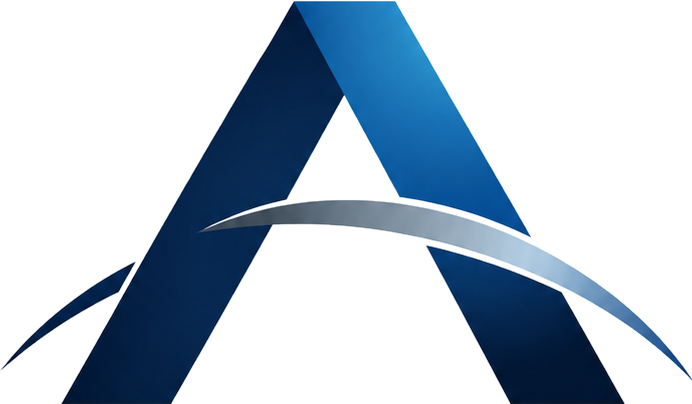
The monogram Two faces of one solid, plus the arc they carry.
Three parts, and each carries something.
| Element | What it is | What it carries |
|---|---|---|
| The shaded left face | The structural plane, #072850 |
The load path, in shadow |
| The lit right face | The face turned to the light: Signal Blue, #2281C3 |
The same structure, made visible |
| The arc | One tapered sweep crossing both legs: Arc Silver, #9EB4C6 |
The span the two legs are there to hold |
The two-plane read is the mark.
The two faces are what make it read as a solid object rather than a letter: one form, seen from a fixed light, so the eye reads depth before it reads the letter A. Take the depth away and what is left is an A with a line through it.
Every cut of the mark is built to preserve that read. That is why the reversed cut is re-lit rather than inverted, and why the single-colour cut knocks the arc out of the A rather than laying it over the top. A cut that loses the two planes is a different mark, so check any new one at the size it will actually be used, not at the size you are drawing it.
Logo
Which cut, on which ground.
The crossover is #1A3A5C. Grounds lighter than it take the positive cut;
grounds darker than it take the reversed cut. If a ground is close to the crossover,
it is the wrong ground.
-
Positive
archeon-lockup.png
Paper#F4F4F1, white, anything lighter than the crossover. -
Reversed
archeon-lockup-reversed.png
Navy#021E42,#0A2A50, anything darker than the crossover. -
Horizontal
archeon-lockup-horizontal-reversed.png
Headers, letterheads and signatures, where the stacked lockup is the wrong shape. -
Compact
archeon-lockup-compact-reversed.png
The descriptor line dropped. Below roughly 40px tall it resolves to about 3px of type, so the compact cut removes it rather than shipping type nobody can read. This is the cut in the header above. -
Single ink, dark on light
archeon-monogram-mono.svg
One file, inheriting the surrounding ink. -
Single ink, light on dark
archeon-monogram-mono.svg
The same file: foil, embroidery, etch, engraving, single-colour print, and UI marks that must take the colour of the type around them.
Clear space
Half the monogram's height, on all four sides. Nothing sits inside it: no type, no rule, no image edge, no other logo. On a lockup, measure from the monogram, not from the bounding box of the whole artwork.
The dashed edge is the limit. It is not part of the mark and is never drawn.
Minimum sizes
| Asset | Digital | What sets the floor | |
|---|---|---|---|
| Monogram | 24px wide | 8mm wide | The arc closing into the legs |
| Compact lockup | 150px wide | 38mm wide | ARCHEON holding about 10px of cap height |
| Full lockup, with tagline | 440px wide | 110mm wide | The tagline reaching 8px of cap height |
monogram, 24px
compact lockup, 150px
The full lockup's floor is set by its tagline, not by its wordmark. The artwork is 1112px wide and the tagline has a cap height of 20px, so the tagline only reaches 8px, the floor for a letterspaced line, at 440px of overall width. Below that, use the compact cut and set the tagline as live text if it is needed. The site footer does exactly this: the column allows 230px, where the tagline in the full lockup renders about 4px tall and is decoration pretending to be a sentence.
The reversed cut is built, not cropped.
The master is light-ground artwork and its wordmark is navy, so on a navy ground the wordmark is invisible and the mark reads as half a logo. The reversed cut sets the type in white and re-lights the faces. It is a separate piece of artwork, not a treatment applied to the positive one.
It is never made by inverting the positive cut. Inversion turns the lit blue face pale and destroys the two-plane read, which leaves a mark that is the right shape and the wrong object.
The single-colour cut knocks the arc out.
In one ink there is no tonal difference between the arc and the legs it crosses. An arc laid over the A would vanish into them and the mark would read as a plain A, so the arc is knocked out of the A instead: it appears as the gap between the two, in the colour of whatever is behind the mark.
archeon-monogram-mono.svg inherits currentColor, so the
same file serves navy on Paper, white on Navy, foil, embroidery and any UI ink
without being re-drawn or re-exported.
Where transparency is a risk, use the pre-flattened files.
archeon-lockup-paper.png is flattened onto Paper and
archeon-lockup-reversed-navy.png onto Navy. Use them for email, PDF and
home-screen icons. iOS composites alpha onto black on a home-screen icon, so a
transparent icon arrives with a black surround nobody chose.
Do not
- Do not put the master on a dark ground. Its wordmark is navy.
- Do not make a reversed cut by inverting the positive one.
- Do not lay the arc over the A in a single-colour setting.
- Do not re-colour the mark. The two faces and the arc are fixed. There is no green Archeon, and a product's accent never re-tints the parent mark.
- Do not re-type the wordmark in Montserrat or anything else.
- Do not stretch, skew, rotate or reproportion. Scale uniformly.
- Do not add drop shadows, glows, bevels, outlines or gradients of your own. The mark already carries its own light.
- Do not enclose the mark in a box, badge or circle it did not come with.
- Do not place the mark on a busy photograph, or over the arc's own crest colour range, where the silver disappears.
- Do not use the monogram as a product's app icon. The monogram identifies the parent; a product's icon is the product's own.
Colour
Every pair we set type in is measured.
Every colour is sampled from the master logo artwork or derived from one that is, and the measured ratio is recorded beside the token. A palette that fails contrast fails silently: it looks fine to the person who chose it.
Signal Blue is not a text colour.
#2281C3 as body text on Paper measures 3.81:1,
and white on a #2281C3 button fill measures
4.20:1. Both fail AA. Signal Blue is correct for fills,
graphics, large display type and the mark itself, and for nothing a user has to read
or click. --ar-signal-deep #1B72B2 and
--ar-signal-lift #5FB2F0 exist for exactly that.
Core
| Token | Hex | Role |
|---|---|---|
--ar-navy |
#021E42 | Archeon Navy. Wordmark ink and the primary dark ground |
--ar-navy-structural |
#072850 | The monogram's shaded face. Elevated surfaces on a dark ground |
--ar-signal |
#2281C3 | Signal Blue, the monogram's lit face. Fills and graphics only |
--ar-arc |
#9EB4C6 | Arc Silver, the crest of the arc. Rules, dividers, decoration. Never text |
Signal, calibrated
| Token | Hex | Measured | Use |
|---|---|---|---|
--ar-signal-deep |
#1B72B2 | 4.65:1 on Paper; white on it 5.13:1 | Links and buttons on light grounds |
--ar-signal-lift |
#5FB2F0 | 7.19:1 on Navy | Links and primary buttons on dark grounds |
Grounds
| Token | Hex | Notes |
|---|---|---|
--ar-paper |
#F4F4F1 | Warm light ground, shared with TankLogic |
--ar-white |
#FFFFFF | |
--ar-surface |
#FCFCFB | Raised surface on Paper |
--ar-surface-dark |
#0A2A50 | Raised surface on Navy. White on it: 14.38:1 |
Ink on light grounds
Ratios measured on Paper #F4F4F1.
| Token | Hex | Ratio | WCAG | Name |
|---|---|---|---|---|
--ar-ink |
#021E42 | 15.04:1 | AAA | |
--ar-ink-2 |
#334251 | 9.35:1 | AAA | Graphite |
--ar-ink-3 |
#46515B | 7.36:1 | AAA | Steel |
--ar-ink-4 |
#77838F | 3.51:1 | none | Non-text only: rules, disabled states, decorative glyphs |
Ink on dark grounds
Ratios measured on Navy #021E42.
| Token | Hex | Ratio | WCAG | Name |
|---|---|---|---|---|
--ar-ink-on-dark |
#FFFFFF | 16.58:1 | AAA | |
--ar-ink-on-dark-2 |
#C9D6E2 | 11.21:1 | AAA | Mist |
--ar-ink-on-dark-3 |
#9BB0C6 | 7.43:1 | AAA | Haze |
--ar-ink-on-dark-4 |
#7F93A8 | 5.24:1 | AA | Slate, and the floor |
Lines
| Token | Value | Ground it is drawn on |
|---|---|---|
--ar-hairline |
rgba(2, 30, 66, 0.12) | Light grounds |
--ar-hairline-on-dark |
rgba(255, 255, 255, 0.14) | Dark grounds |
Status
Fixed across the company, so a number that is red in one Archeon product is never amber in another. A product does not restyle them.
| Token | Hex |
|---|---|
--ar-ok |
#0CA30C |
--ar-warn |
#FAB219 |
--ar-serious |
#EC835A |
--ar-critical |
#D03B3B |
Product accents
| Product | Token | Hex | On Paper | White on it | Status |
|---|---|---|---|---|---|
| TankLogic | --ar-product-tanklogic |
#2A78D6 | 4.01:1 | not measured | shipped |
| TankLogic | --ar-product-tanklogic-deep |
#1C5CAB | 6.01:1 | 6.63:1 | shipped |
| Pressure vessel | --ar-product-vessel |
#12A3B4 | 2.75:1 | not measured | reserved |
| Pressure vessel | --ar-product-vessel-deep |
#0A6F7C | 5.33:1 | 5.87:1 | reserved |
| Piping | --ar-product-piping |
#C77A0A | 3.07:1 | not measured | reserved |
| Piping | --ar-product-piping-deep |
#8F5705 | 5.39:1 | 5.94:1 | reserved |
The parent owns the navy. Each product owns exactly one accent, and never invents a second. A product that wants a second accent wants a second brand. The reserved rows are reserved: a future product does not pick its own accent, it takes the one held for it here.
Read the three plain accents at 4.01:1, 2.75:1 and 3.07:1 for what they are. None
of them is a text colour on Paper. Set text and button fills from the
-deep cut.
Gradients, taken from the mark
The monogram's own fills, extracted so a surface can be lit the same way the mark is. They are not general-purpose decoration.
| Token | Value |
|---|---|
--ar-gradient-face |
linear-gradient(180deg, #1E78B9 0%, #065099 50%, #021736 100%) |
--ar-gradient-arc |
linear-gradient(90deg, #06203F 0%, #697987 50%, #9EB4C6 63%, #4573A6 90%, #17456F 100%) |
Typography
Three stacks, and one thing that is not a font.
| Role | Stack | Token |
|---|---|---|
| Display | "Montserrat", system-ui, -apple-system, "Segoe UI", sans-serif | --ar-font-display |
| Body | system-ui, -apple-system, "Segoe UI", sans-serif | --ar-font |
| Mono | ui-monospace, SFMono-Regular, Menlo, monospace | --ar-font-mono |
Engineering a more certain tomorrow.
Every calculated value carries the formula as implemented, the values actually substituted, and the clause it cites.
clause 5.6.3.2 · API 650 13th Edition · Table 5.1a · TL-0247 · 13.18 mm
Where each one goes
Montserrat is for headlines set near the wordmark: a hero line, a cover page, a section head on a corporate surface, where its geometry has to agree with the lockup. It is not a UI font.
Body is the system stack, matching TankLogic. The application is a working tool; it should render in the typeface the operating system already renders everything else in, at the weights the OS hints for.
Mono carries anything that must be transcribed exactly: numbers,
clause references, edition labels, document numbers, material grades, identifiers,
engine versions and package names. Set
font-variant-numeric: tabular-nums on every column of numbers, so digits
line up down the column and a changed digit is visible.
Tracking: --ar-tracking-wordmark is 0.18em, the lockup's
own. --ar-tracking-eyebrow is 0.14em, for the small caps
label above a heading.
The wordmark is artwork, and is never re-typed.

archeon-wordmark.png, or a lockup file.
ARCHEON
Montserrat at the wordmark's tracking. Close, and not the same.
The ARCHEON wordmark is fixed artwork. Not Montserrat, not anything
else, not just for one slide. It has its own tracking and its own letterform
corrections, and a typed copy is a near-miss that gets further from the original
every time someone redoes it. Use archeon-wordmark.png,
archeon-wordmark-only.png, or a lockup file.
Naming
Products carry their own name. The parent endorses.
Everything above this is appearance. This is correctness, and one rule in it reaches the steel.
TankLogic, by Archeon Global
Never Archeon TankLogic: products carry their own name and the parent endorses, and the compound is neither. Never TankLogic by Archeon Global Private Limited in a masthead, because the legal form belongs in the legal footer.
A product never takes the Archeon monogram as its app icon. The monogram is the parent's icon and identifies the parent's own surfaces. A product whose icon is the parent's monogram is unidentifiable in a dock next to its siblings, and it tells the user the wrong thing about who owns the screen.
Which name, where
| Name | What it is | Where it is used |
|---|---|---|
| Archeon Global Private Limited | The legal entity | Contracts, invoices, statutory filings, licence headers, the legal line in a site footer, first mention in a press release |
| Archeon Global | The company as it speaks and is spoken about | Everything else: the site, decks, endorsement lines, proposals after first mention |
| Archeon Engineering | An engineering services division | Service descriptions and proposals. Not a product: no subdomain, no app icon, no accent colour of its own. It speaks as Archeon Global |
| TankLogic | The product | Product UI, app name, PDF footers, subdomain, document-number prefix TL- |
| API 650 | The standard | Clause references, edition labels, engine package names. Never a product name |
API 650 is a standard, not a product name, and is never renamed.
The string occurs in two distinct roles, and the two are renamed by opposite rules.
| Role | Examples | Rule |
|---|---|---|
| The product | Wordmark, page title, PDF footer, app name, document-number prefix | Renamed to TankLogic |
| The standard | clause 5.6.3.2, API 650 13th Edition, Table 5.1a, "in accordance with the referenced API 650 code edition" |
Must never change |
A calculation package becomes a fabrication drawing, and the fabrication drawing becomes a steel order. A clause reference renamed to a product name cites a standard that does not exist, in a document a fabricator will build from. The defect does not surface in a test run; it surfaces in steel.
Clause references, edition labels and table numbers are reproduced exactly, in the standard's own wording and its own capitalisation. The same rule holds for engine package names, which are named after the standard they implement rather than after the product that ships them: the standard stays API 650 whatever the product is called.
Forbidden forms
| Do not write | Why | Write |
|---|---|---|
| Archeon Global Pvt. Ltd. in product UI | The legal abbreviation belongs in contracts and the legal footer, nowhere a user works | Archeon Global |
| ArcheonGlobal | Not the name. The closed compound exists only as an address, and an address is not a name | Archeon Global |
| Archeon, alone, for the company | Archeon is the root the names are built from, and Archeon Engineering is a division. A bare Archeon is ambiguous about which is meant | Archeon Global |
| Archeon TankLogic | Products carry their own name; the parent endorses. The compound is neither | TankLogic, by Archeon Global |
| Tanklogic, Tank Logic, TANKLOGIC in prose | The product is TankLogic: capital T, capital L, closed, no space | TankLogic |
| TankLogic 650, Archeon 650 | Implies a standard that does not exist | TankLogic |
| API 650 replaced by a product name in a clause reference, edition label or table number | It becomes a fabrication drawing | API 650, unchanged |
| The ARCHEON wordmark re-typed in a font | The wordmark is fixed artwork with its own tracking and letterform corrections | archeon-wordmark.png, or a lockup file |
| The Archeon monogram as a product app icon | The monogram identifies the parent, not the product | The product's own icon |
Boilerplate
Use verbatim.
Three lengths, for three jobs. Do not paraphrase them into marketing register, and do not stitch two of them together.
- Legal name
- Archeon Global Private Limited
- Name in use
- Archeon Global
- Tagline
- Engineering a more certain tomorrow.
25 words footer, directory listing, badge
Archeon Global Private Limited builds engineering software. Its first product, TankLogic, replaces the interlinked Excel workbooks behind API 650 storage-tank design with linked, auditable calculations.
50 words press kit, about box, conference bio
Archeon Global Private Limited builds engineering software for the people who are personally liable for the drawing. TankLogic, its first product, replaces the interlinked Excel workbooks behind API 650 storage-tank design with linked calculation modules. Every number carries its formula and clause, and a stale result cannot render as current.
100 words proposal, tender, long-form profile
Archeon Global Private Limited is an engineering software company. It builds software for work that actually gets built: the calculation that becomes a fabrication drawing and then a steel order. Its first shipped product, TankLogic, replaces the interlinked Excel workbooks behind API 650 storage-tank design with linked calculation modules. Data moves between calculations through explicit links rather than re-typing. Staleness is derived from content hashes at read time, never stored as a flag, so a stale result is structurally incapable of rendering as current. Where the evidence is missing, the software refuses rather than substitutes. Engineering a more certain tomorrow.
The one-line promise: every number knows where it came from, and a stale one cannot pretend otherwise.